Concept
Therapists is a healthcare discovery platform created to help people find and connect with trusted therapy, wellness, and healthcare professionals. The project supported the platform’s evolution from We Are Therapists into a broader, more scalable brand experience built for future growth across multiple care specialties.
User/Problem
The primary users are people looking for mental health, therapy, or wellness support, as well as healthcare professionals who need to present their services with credibility and clarity. In this context, the design challenge was not only visual polish; it was trust. Users making healthcare decisions are often comparing unfamiliar providers, reading sensitive information, and deciding whether a service feels safe enough to contact.
The platform also had a business challenge: the original identity was too narrow for its expanded mission. While the earlier brand focused on therapists and counseling centers, the new direction needed to support psychologists, psychiatrists, speech therapists, nutritionists, and other specialists without losing the emotional reassurance expected from a health-related experience.
That meant the interface, copy, and visual language needed to reduce cognitive load, make service information easier to scan, and create a consistent sense of professionalism across the website, brand identity, and marketing communications.
Creative Direction
The creative direction was guided by three principles: clarity, calm, and scalability. Every design decision needed to help users understand where they were, what the platform offered, and how to take the next step without feeling overwhelmed.
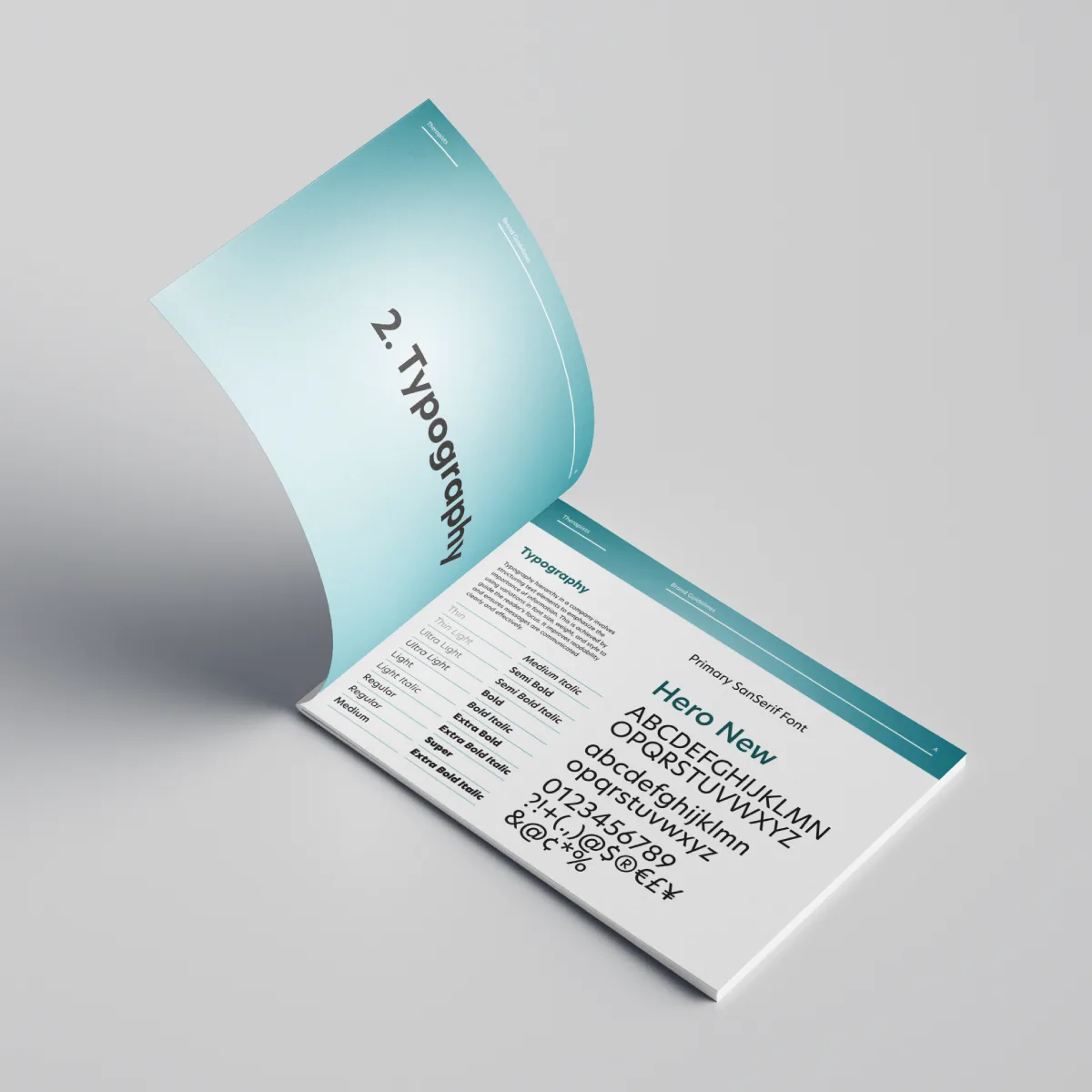
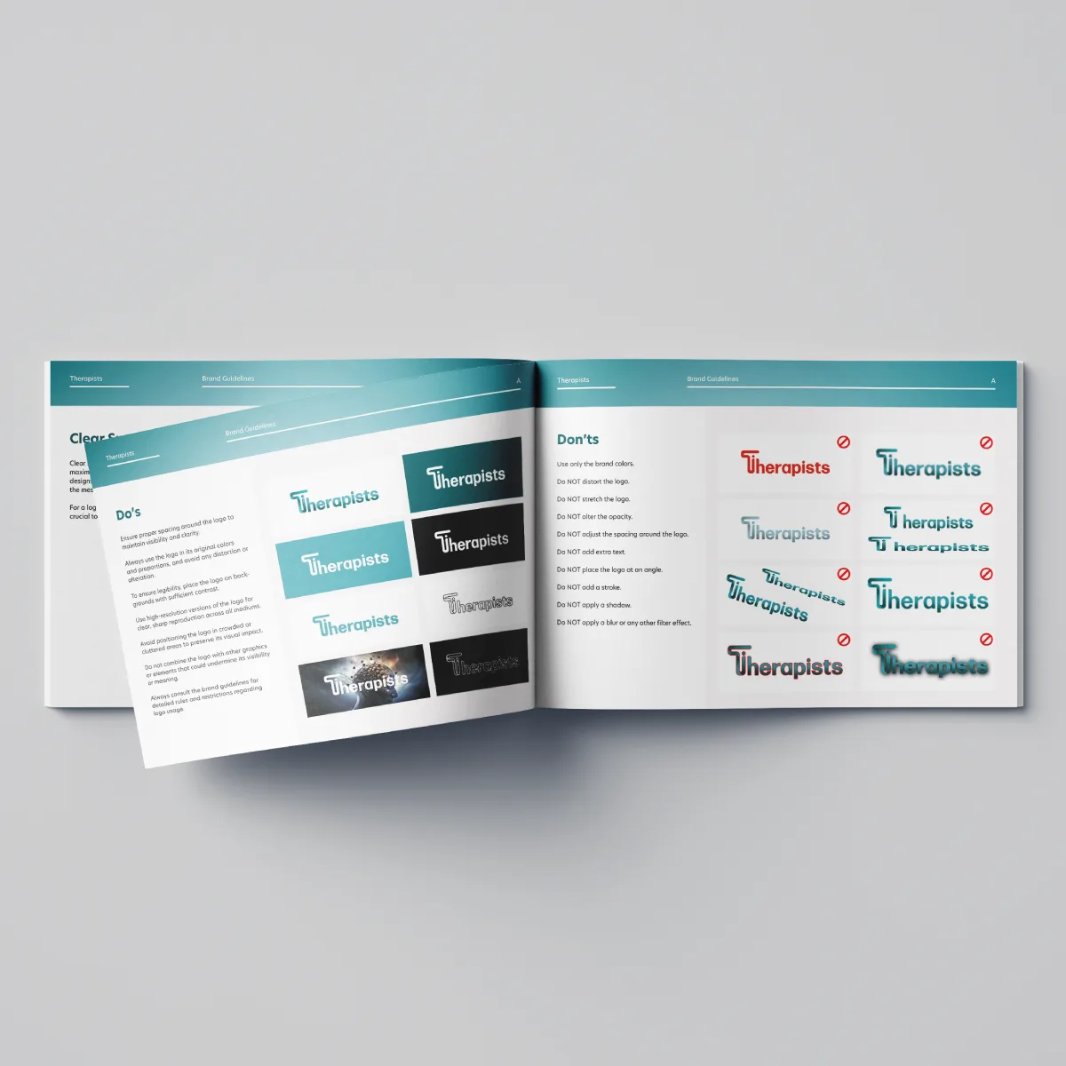
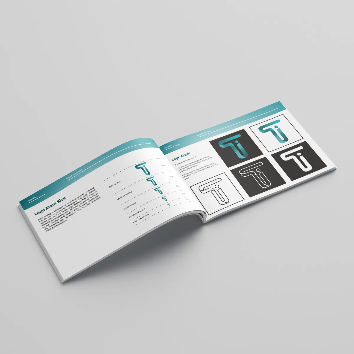
I led the UI direction, website copy, and WordPress/Elementor build with a focus on making the experience feel approachable but still medically credible. The color palette was refined around trust, mental clarity, and accessibility, while typography choices prioritized readability across desktop and mobile. The broader brand system included logo usage, typography guidelines, color rules, iconography direction, and voice-and-tone recommendations so the platform could remain consistent as new provider categories and marketing channels were added.
Accessibility was treated as part of the trust strategy, not as a final checklist. Color contrast, readable typography, clear hierarchy, and properly labeled forms were considered core experience requirements because users seeking care need an interface that feels legible, predictable, and respectful.
Execution
The website was built in WordPress with Elementor so the team could continue editing content after launch without relying on a developer for every update. The page structure was organized around clear content blocks, responsive layouts, and visible calls to action that support both discovery and conversion.
The UI system translated the refreshed brand into practical interaction patterns: clear section hierarchy, consistent spacing, easy-to-read content areas, and mobile-first layouts that keep important information visible on smaller screens. Copy was rewritten to make the platform’s broader healthcare mission easier to understand while keeping the tone professional, reassuring, and human.
Form labels and interface text were written for clarity, reducing ambiguity at moments where users may be ready to ask for help or make contact. The design also accounted for future scale: new provider types, educational content, campaign pages, and marketing assets could be added without breaking the visual system.
Beyond the website, the project extended into a complete identity system and a custom Klaviyo email template. This ensured that the user experience stayed consistent across brand touchpoints, from the first website visit to ongoing healthcare and wellness communication.
Impact
The launch gave Therapists a more focused, scalable, and user-centered foundation for growth. The platform moved from a narrower therapy-focused identity into a broader healthcare and wellness brand system that can support multiple professional categories while maintaining trust and clarity.
The immediate impact was a more cohesive experience across the website, brand identity, and email marketing system. Internally, the editable WordPress/Elementor setup gave the team more control over future content updates, while the brand guide created a shared reference for maintaining consistency across collaborators and campaigns.
The key learning from this project was that healthcare design depends on more than aesthetics. In a sensitive decision journey, accessible typography, clear labels, calm hierarchy, and consistent language directly shape whether users feel confident enough to continue. For a platform like Therapists, good design had to make the experience feel trustworthy before asking users to take action.