
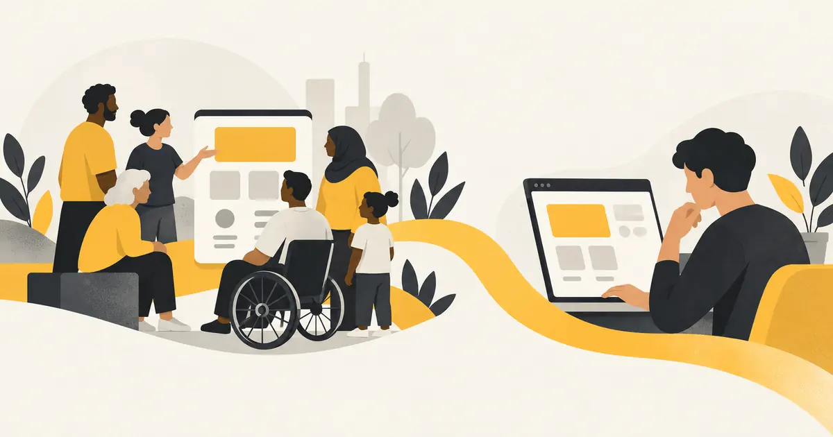
Human-centered design and user-centered design both start with people. The useful question is where you focus your attention: the wider experience surrounding a service, or the tasks someone needs to complete while using it.
The ATM infographic below makes that distinction easy to picture. One side considers customers, older adults, people with disabilities, technicians, security staff and the business. The other follows a customer through a withdrawal. For a Brooklyn business website, both perspectives matter: visitors need a clear path, and the team behind the website needs a practical way to deliver what it promises.
This guide explains the overlap, seven practical lessons, and a checklist you can use before your next website redesign.
What is human-centered design?
Human-centered design is an approach to solving problems by understanding people’s needs, circumstances and experiences. The work starts with research rather than assumptions, then develops and tests possible solutions. It also looks beyond the screen to the situations in which a product or service is used.
Digital.gov describes human-centered design as a framework that brings the human perspective into the problem-solving process. Its guidance includes discovery, design, delivery and measurement. That final stage matters: launching something does not prove that it works for the people who need it.
For a website, the questions might include: Can visitors understand the service? Can someone with an accessibility need use the inquiry form? Does the business have a workable process for responding? What happens when someone is confused or needs help?
What is user-centered design?
User-centered design concentrates on understanding the people using a product, their goals, their tasks and their context. Designers use that understanding to create, evaluate and refine the experience. Microsoft’s usability guidance describes a process that puts users’ needs at the center of design decisions and uses testing to understand how people interact with an interface.
On a business website, this means examining tasks such as finding a service, comparing options, reading project examples, completing a form or checking what happens after an inquiry.
A useful distinction, with an important qualification
The infographic presents human-centered design as the wider view and user-centered design as the specific user’s journey. That is a helpful teaching device, but it is not a universal boundary. The terms overlap and are sometimes used interchangeably. User-centered work can consider stakeholders, accessibility and the wider service; human-centered work can examine a single interface task in detail.
Neither approach means designing for an imaginary average person. Different abilities, levels of experience, languages and circumstances can change what people need from the same website.
Human-centered design through the ATM example
Imagine an ATM that has clear buttons and a simple withdrawal flow, but is positioned where a wheelchair user cannot comfortably reach its controls. Or imagine a machine that customers find easy to use, but technicians struggle to maintain. A smooth sequence of screens does not resolve every problem around the service.
The infographic’s wider view includes several needs:
- Customers: understandable choices and a predictable way to complete a transaction.
- Older adults: readable information and an experience that does not depend on familiarity with hidden controls.
- People with disabilities: accessible interaction, physical access and suitable ways to receive information.
- Technicians: equipment that can be inspected, maintained and repaired.
- Security staff and the business: an environment and operating process that support safe, reliable service.
The customer journey then focuses attention on individual steps: inserting a card, entering a PIN, choosing a service, entering an amount, collecting cash and retrieving the card. In this simplified example, clear instructions and feedback help people understand where they are and what happens next.
For websites, human-centered design considers both the complete service and the individual actions that connect a visitor to it.
7 essential lessons for better business websites
1. Begin human-centered design with research
Start human-centered design with the questions visitors bring to the website. A first-time customer may need a plain-language explanation of the service. A returning customer may want a direct route to an inquiry. Someone comparing providers may look for relevant examples, scope and practical details.
Talk with customers and the people who answer their questions. Review the language used in genuine inquiries. Ask what visitors struggle to find, what they misunderstand and what information they need before deciding. Those answers should influence page structure before anyone debates the hero image.
2. Design around a clear task
User-centered design becomes concrete when you define a task that can be observed. “Make the website engaging” is difficult to test. “Find the right service and send an inquiry” gives the team something specific to evaluate.
A visitor should be able to move from the service explanation to relevant examples and an appropriate next step. Buttons should describe that step. “Request a project quote” communicates more than a vague invitation to explore. The destination should match the promise: a quote button should lead to a relevant inquiry path, with enough context to continue.
3. Build accessibility into human-centered design
Human-centered design asks whose circumstances might be missing from the brief. A person may use a keyboard, enlarge the text, rely on a screen reader or browse on a small display. A busy visitor may also need simpler wording and fewer distractions.
Use descriptive headings, readable text, clear form labels and meaningful link text. Do not make color the only way to understand a status or instruction. Check keyboard navigation and focus visibility. These are useful design considerations, but a short checklist does not establish full accessibility conformance; evaluation needs to cover the actual website and its interactions.
4. Make forms useful to visitors and the team
An inquiry form connects the visitor’s task to the business’s workflow. Too little information can create repeated follow-up. Too many required fields can make the form difficult to complete, especially when the visitor is still exploring options.
Ask why each field is needed at this stage. Label required and optional information clearly, explain unfamiliar requests and provide helpful error messages. If a visitor shares a phone number, distinguish collecting that information from promising a callback. If replies are handled by email, make that contact method clear. Human-centered design considers both the person submitting the form and the person responding.
5. Explain what happens after an action
The ATM example uses feedback to show that an action has worked and another step is available. A website needs the same clarity. After someone submits a form, a confirmation should explain whether the message was sent and what the next step is.
Avoid promises the business cannot reliably keep. If response times vary, do not invent a guaranteed turnaround to make the page sound reassuring. Provide an accurate expectation instead. Review error states as carefully as successful ones: an interrupted submission should leave the visitor with a useful path forward, rather than a generic failure message.
6. Test an experience instead of defending an opinion
A page can look polished and still leave visitors unsure where to go. In a task-based review, ask someone to find a service, understand its scope and begin an inquiry. Observe where they hesitate or misunderstand the page.
Let participants attempt the task without coaching them through every step. If you have to explain the navigation, that explanation is evidence that the design may need work. Record the problems, improve the relevant parts and test again. Include people whose devices, experience and access needs reflect the audience you intend to serve.
7. Measure human-centered design after launch
Human-centered design continues after a website goes live. Compare the questions people ask with the information the site provides. Look for recurring misunderstandings, difficult form fields and service pages that attract inquiries for the wrong work.
Analytics can show patterns, while conversations and usability sessions can help explain them. A higher number of form submissions is not automatically an improvement if most are irrelevant. Choose measures that reflect the purpose of the page, such as successful task completion, clearer inquiries and fewer avoidable errors. Make a focused change, then review its effect.
How the two perspectives work together
Think of these as complementary questions rather than competing design labels:
- Wider human perspective
- Who is affected, what circumstances matter, and can the complete service support their needs?
- Specific user task
- What is this person trying to do, and can they complete it clearly and confidently?
- Shared working method
- Research the context, create a possible solution, test it with relevant people and refine it using evidence.
A simple website redesign example makes this practical. A Brooklyn event business wants more useful inquiries. The wider view considers the planner, the family organizing the celebration, accessibility needs, and the team preparing quotes. The task view checks whether a visitor can find the right service, understand the deliverables and complete the inquiry. Human-centered design and user-centered design can inform the same redesign.
A human-centered design checklist for your website
Before approving a design, review the experience with these questions:
- Can a first-time visitor explain what you offer after reading the introduction?
- Do service pages describe useful deliverables and relevant limitations?
- Are headings, navigation labels and buttons understandable without explanation?
- Can people read and use the page on a small screen and with a keyboard?
- Do images have appropriate alternative text when they communicate information?
- Does every form field have a clear purpose and an understandable label?
- Do confirmation and error messages explain the next step?
- Can the team maintain the content and respond through the stated contact method?
- Have relevant people tried the main tasks without being coached?
- Is there a plan to review the experience after launch?
Use the answers to prioritize improvements. A confusing service description or broken form is usually a more immediate problem than choosing between two decorative effects.
Frequently asked questions
Are human-centered design and user-centered design the same?
They have substantial overlap. Human-centered design often describes a broad perspective on people’s needs and circumstances, while user-centered design emphasizes the people using a product and the tasks they need to complete. In practice, teams may use either term for closely related research, design and evaluation activities.
Does user-centered design include accessibility?
Yes. Understanding users includes understanding different abilities, access needs and contexts of use. Accessibility should not be assigned only to the human-centered side of the infographic. Both approaches should consider who might otherwise be excluded.
Can a small business apply these ideas without a large research budget?
Yes. Start with a focused task, review common customer questions and observe relevant people attempting that task on the website. Be clear about the limits of a small review: a few conversations can reveal useful problems, but they do not represent every visitor or replace a thorough evaluation.
Will a people-focused website automatically rank higher?
No. Clear, useful content and a usable experience support the purpose of a website, but they do not guarantee search rankings. Technical SEO, search intent and the quality of the content still need attention. A plugin score is an editing aid, not a forecast of traffic or business results.
Put human-centered design into practice: three task tests
Turn the ideas into observations before commissioning a complete redesign. The examples below are hypothetical exercises, not client results. Each combines a wider service question with a task you can ask someone to attempt.
An event website: find the information needed to attend
For a wedding or Sweet 16 website, the immediate user may be a guest trying to find the venue, date or RSVP instructions. The wider experience also involves the host who manages responses and guests who may need different ways to access the information.
A useful task is: “You have received this invitation link. Find where the event takes place and show how you would respond.” Observe whether the person notices the RSVP deadline, understands the attendance options and can locate the venue information without searching through decorative sections.
Human-centered design then extends the review to the host: are the responses organized in a way they can use? Is there an email route for a guest who needs clarification? Improving the RSVP button alone will not fix an unclear deadline or a confusing response process. Explore our Sweet 16 website design service for examples of the features a celebration website can include.
A service website: understand the offer before requesting a quote
Imagine someone comparing design services for a new Brooklyn business. They want to know whether a package includes strategy, a logo, a website or print artwork. The business receiving the inquiry needs enough information to suggest an appropriate scope.
Ask a participant to identify a suitable service and explain what they think they would receive. Then ask them to locate the inquiry form. Listen for assumptions: do they believe printing is included when the service supplies design files? Do they understand that a website project needs content as well as a layout?
Use your human-centered design observations to improve deliverable descriptions, boundaries and form guidance. Human-centered design makes the connection between a clear promise on the page and a manageable conversation behind the scenes. The goal is an informed inquiry, rather than a click obtained through ambiguity.
A content-heavy website: find an answer without reading everything
A visitor to a long article or resource page may want one answer rather than a complete reading experience. They might arrive from a search result, scan the headings and leave once they understand the relevant point.
Give someone a question the page should answer, then observe how they look for it. Clear headings, a useful contents list and descriptive links can help them navigate. A visually impressive page that hides its main explanation behind repeated introductions makes the task harder.
Also review the maintenance side. Can the content owner identify outdated information and update it without disturbing the layout? Human-centered design considers that ongoing work because inaccurate or neglected content eventually becomes a visitor problem.
Write a short research brief before testing
Keep your first human-centered design review focused. Write down the task, the people who should participate, the device or access context, and what would count as success. Agree on what you will observe: finding the right information, understanding a service boundary, completing a step, or recovering from an error.
Record what happened before deciding why it happened. “The participant clicked three unrelated links before finding the form” is a more useful observation than “the navigation is bad.” Follow up with open questions about what they expected to find.
Finally, separate evidence from preference. A participant may dislike a color while completing every task easily, or praise a design while misunderstanding the service. Review both, but prioritize the issues that prevent people from achieving their goals. This keeps human-centered design grounded in the experience rather than the team’s enthusiasm for a particular visual direction.
Put people at the center of your next website project
CMT Graphics helps businesses in Brooklyn, Sheepshead Bay and beyond connect their brand, content and website structure. If visitors struggle to understand your services or complete an inquiry, start by examining that experience.
Explore our WordPress website design services, learn how branding supports a consistent message, or read about SEO services. To discuss your website, send a project inquiry or email info@cmtgraphics.com.
Good human-centered design starts with a useful question: what do the people on both sides of this experience need to make it work?